Mazda are coming out with a new logo I think I prefer the old one

3 Likes
Yeah on an image like that the old one is much better. Will need to see how it stands on a bumper or on the wheels.
Gram strategy: all plastic logos get replaced with stickers ![]()
4 Likes
Looks like it should have 2 eyes and a ninja outfit!
3 Likes
4 Likes
A fellow Amiga owner?!
Never owned one personally. A friend had one so I played plenty of Amiga games in the early 90s. I always had a PC - most games were released on both platforms.
1 Like
I’m not keen on the new design. Losing the curves makes it look amateur.
2 Likes

A couple of months ago I asked custom painter and sign artist Neil Melliard what he would suggest I had painted on my O/S/R wing given that I am not a fan of the current Mazda logo or logo font. He suggesred we look at some old Mazda logos and was spell bound by what turned out to be Mazda’s 1959 logo, conveniently the year I was born, Turns out the logo bears a passing resemblence to a Holman Moody logo, which is more in line with Neils regular customers. If I ever have Madge debadged I’d be tempted to replace them with hand painted versions of the '59 logo.
2 Likes
Is this after the merger with Vauxhall?
2 Likes
what merger does vauxhall own mazda
1 Like
It’s a joke.
![]()
1 Like
Yep I was jesting, didn’t mean to wind anyone up. Looks a bit Vauxhall’ish though.
2 Likes
It’s lost the flowing lines on the wings. Much prefer the old one. When you’ve got something good leave well alone.
3 Likes
There has not been a huge amount of actual news, comment or Press to accompany the registration of this design tweak, so not sure it is going to be corporate wide or aligned to the inevitable EV chapter coming.
To my eyes, the angular inclusion also takes some designs cues in part, from their 1936 design
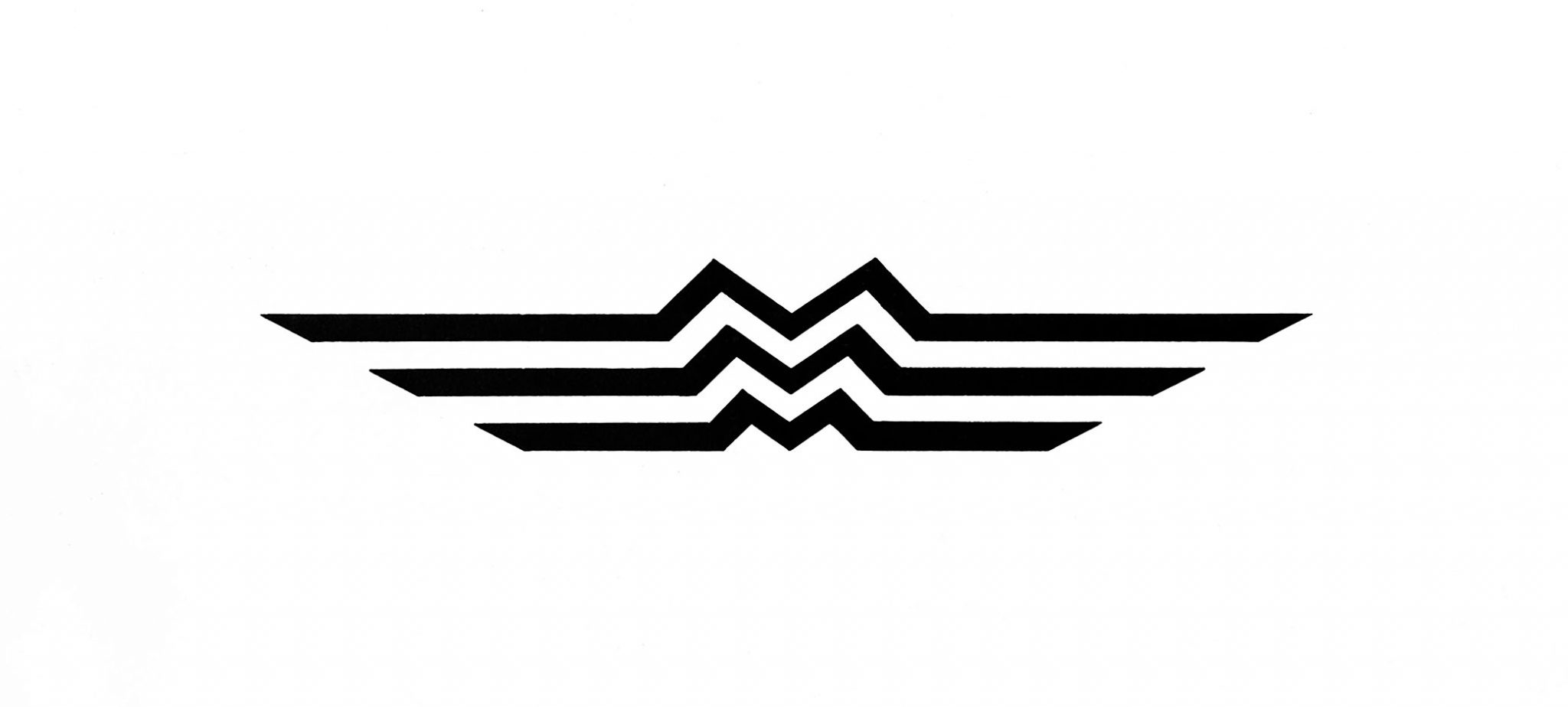
" From 1936 Mazda also had a new logo that was inspired by the emblem of Hiroshima city. The emblem of Mazda’s home town features three waved white lines on a green background that represent the three flows of the Ota River delta in Hiroshima. The Mazda emblem straightened the lines and inserted a flattened M shape into the centre of each line. The three Ms stood for Mazda Motor Corporation, while the long side extensions represented wings for agility, speed and the ability to soar to new heights. This aviation looking symbol can be seen on the front of many of the later versions of the Mazda Go and in fact lasted well into the post-war period up to 1959."
Source
2 Likes
Yup. Old one for sure gets my vote too. New version does not represent how I feel when I’m in me wee ‘Tweeks’
Gotcha!
I like the clean simplicity of one on the right.
I th k the one on the left is a lot smarter,has more quality look,the new black one looks no better than some cheap sticker.
Simon
2 Likes
I like the new logo, but I wish it was more colorful or with a chrome finish and had a 3D effect.
1 Like