I find the new forum good but noticed even though i have fast broadband it takes 15-20 seconds to log in, ok when in though.
Must admit I don’t like the new website format at all.
I used to visit every couple of days or so but now it’s probably once a week if that. Just seems some much harder and less intuitive than the old one…
I really found the old site very easy and logical to use,i am not a great computer buff but think the new site is a load of rubbish and nearly imposs,no pleasure at all to use and find anything,so do not really bother a lot now such ,just a big mess compared to old site
When I click on the MX-5 Owners Club icon I see what you have shown in the screenshot which is why I am confused I think.
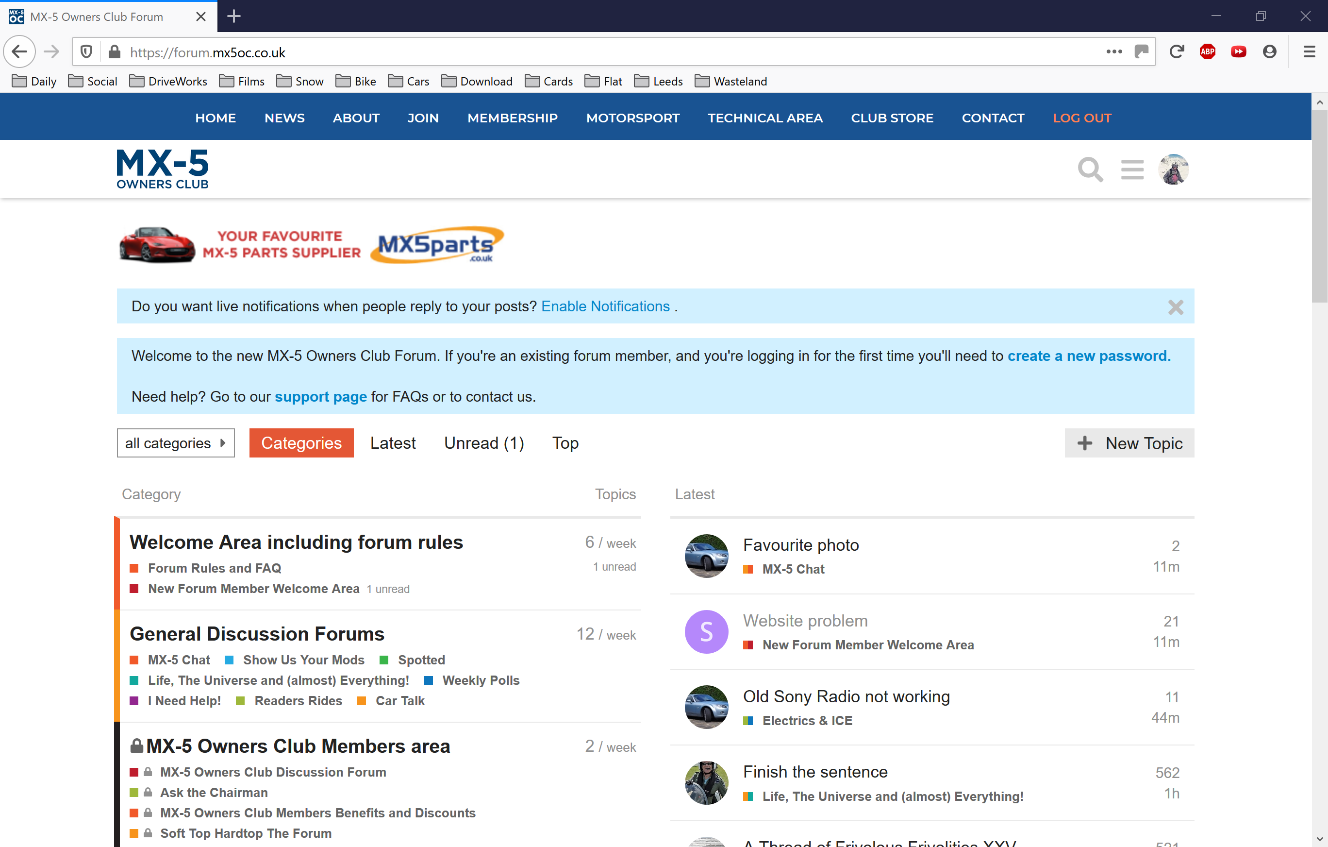
So for me, clicking the MX-5 Owners Club icon displays this:
I don’t actually know how to browse to ‘Categories’…
What does the page look like when you click on the MX-5 Owners Club icon?
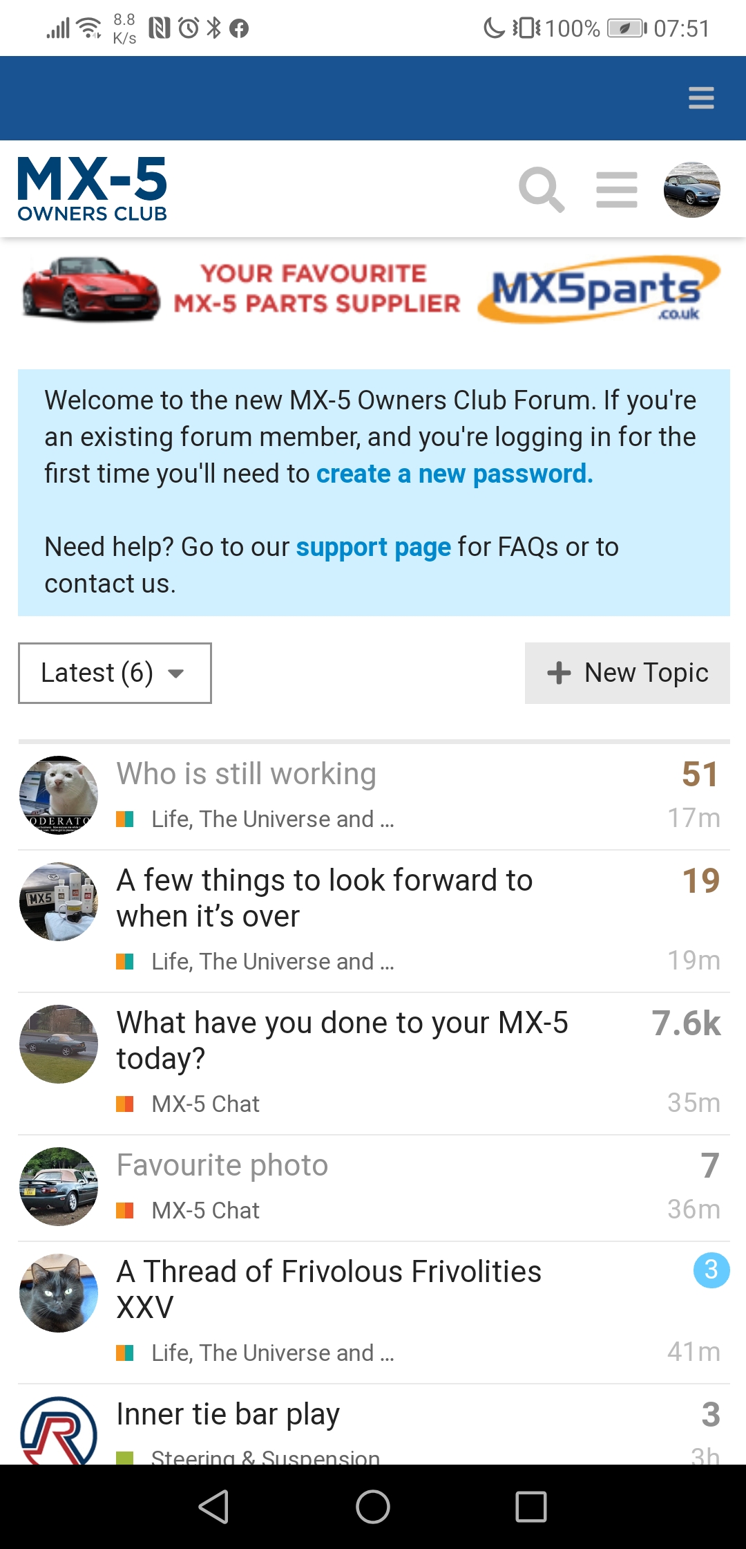
I just get ‘Latest’ as a whole screen. How odd. I wonder if I’ve changed a setting? I wonder how many other people have changed the same setting and we’re all seeing slightly different things when we click on links! It seems to do for you what I think it should do but doesn’t for me. How odd! 
Preferences > Interface > Select Home Page
Done! Had no idea I’d changed that.
This confirms my confusion, I have been enjoying the new forum but that sounds like it could be down to me having a different experience all together compared to others!
What device do you use to access the forum? It may be down to screen size or something along those lines.
It was a setting I’d changed without realising I’d changed it!
On Firefox 74 here with no issues, but running on Ubuntu 19.10 rather than MS Windows
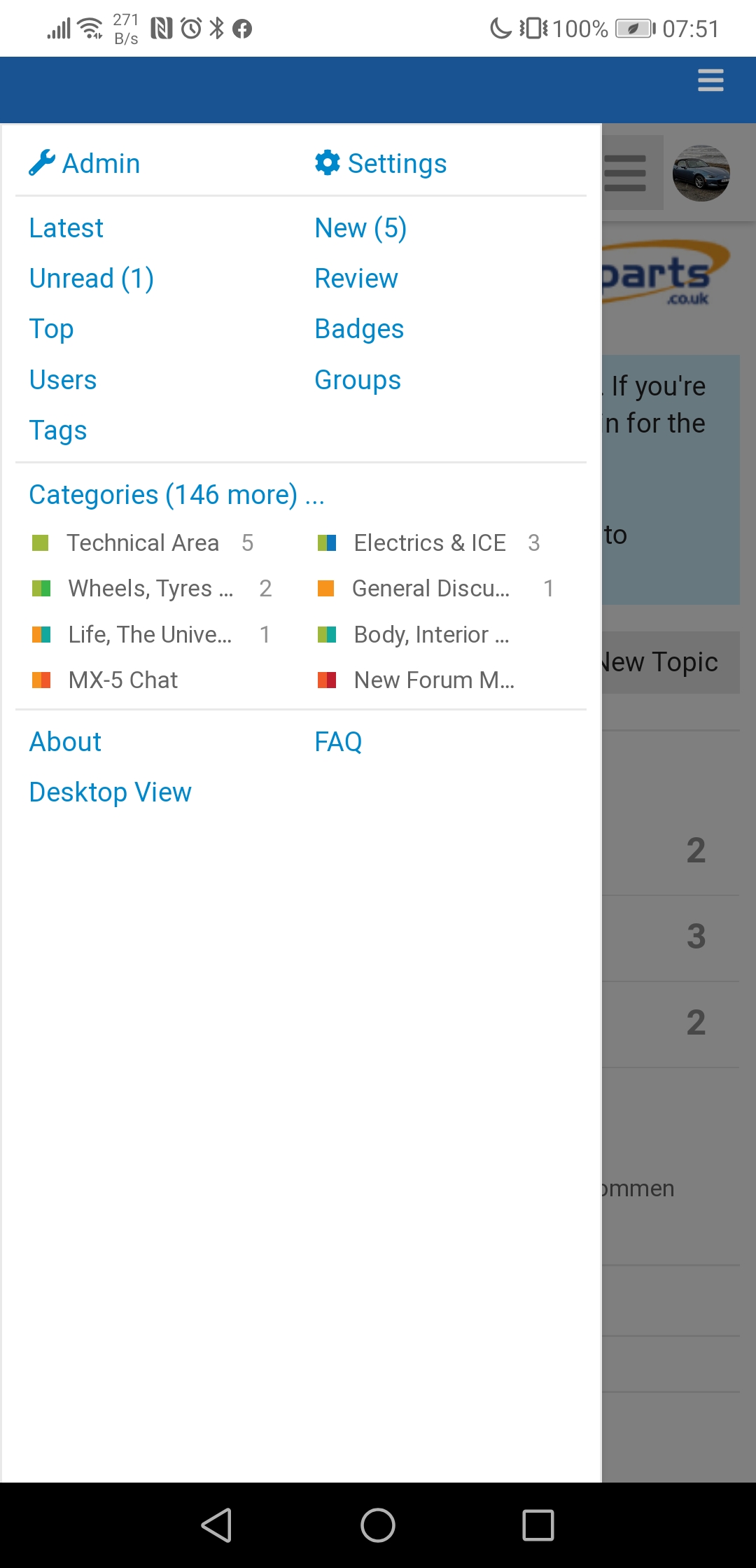
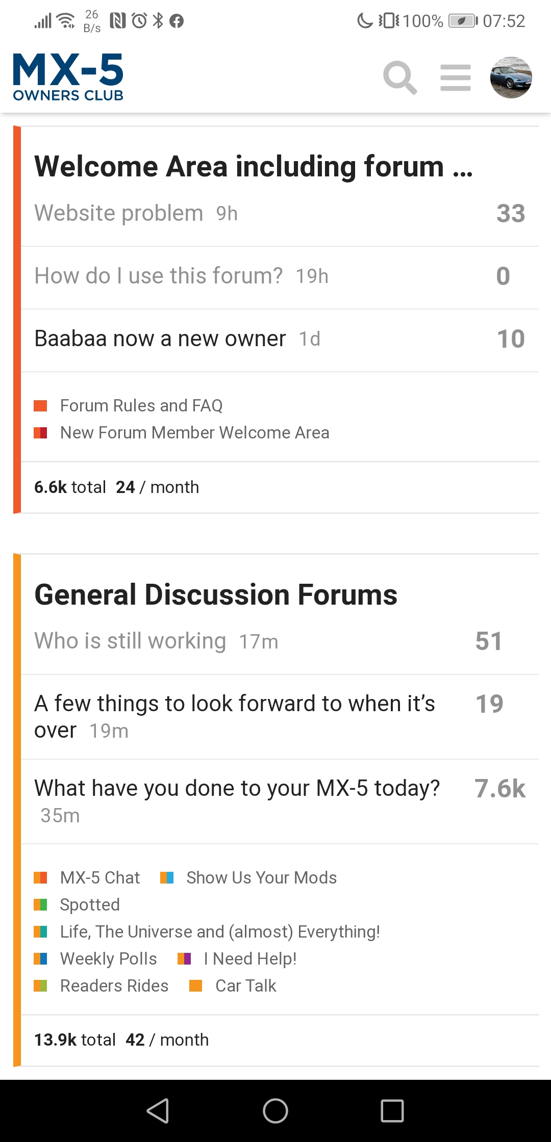
This is the view I have with Categories down the left and new posts on the right.
Categories have flags next to them if there are new posts within and then there’s the new posts/active topics since last visit on the right offering a variety of ways to see what’s going on, some very like the old forum in fact… though a bit more colourful perhaps 
Or I had changed and you had the standard experience…
@IanH do you know what the defaults is for:
Those are the features I like so much about that view!
1 Like
Indeed, which is why I find the animosity from some puzzling. Aesthetically it’s different, but actually it’s pretty much the same. Just faster and with more features.
1 Like
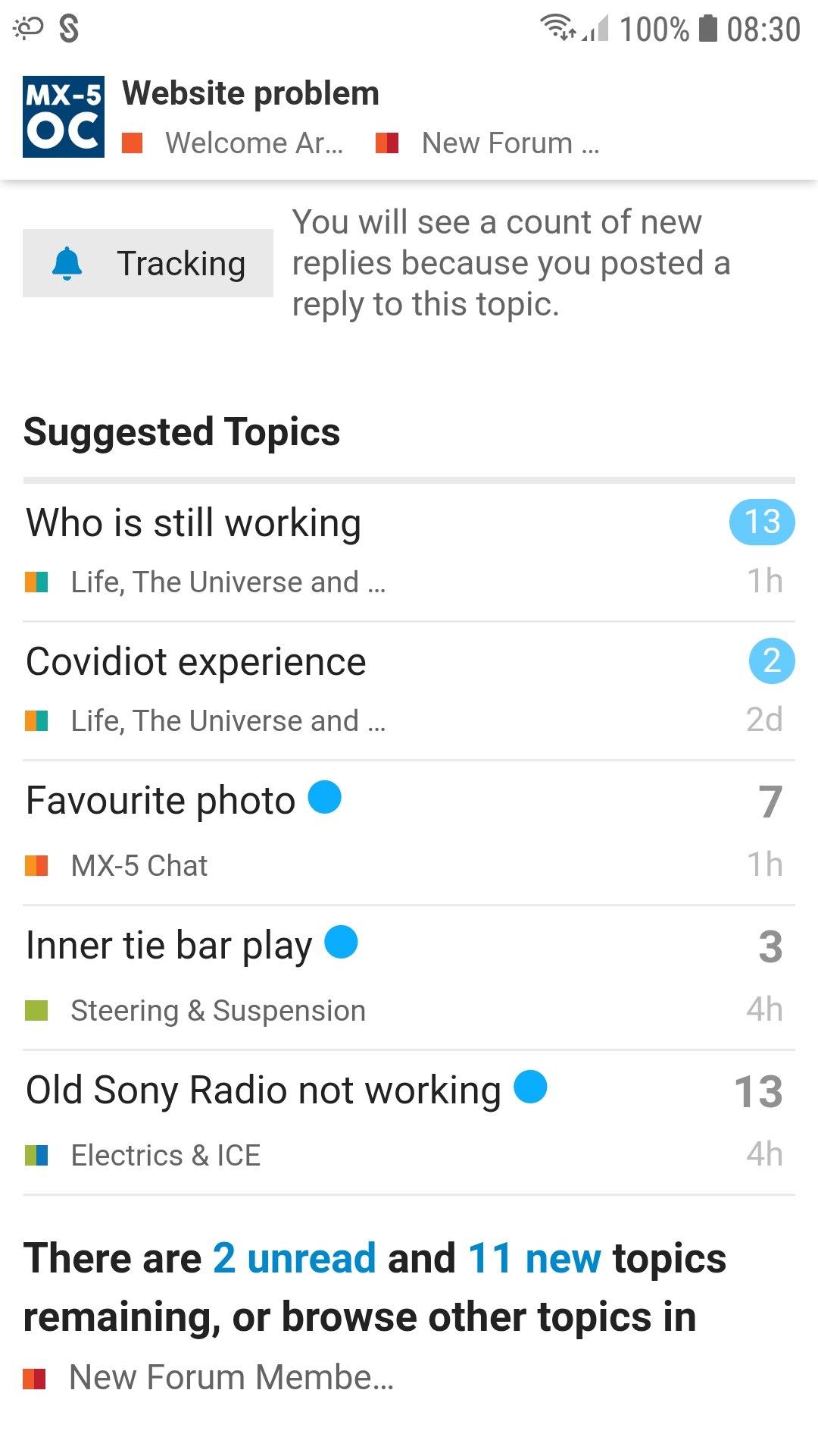
One minor annoyance when viewing a post is the Suggested Topics below it. But I work around it, ignore it.
If one makes the mistake of clicking on a Suggested Topic then the immediately useful menu bars get lost because of this detour and the quickest way out of this trap is home via the MX-5 OC button, or sufficient hits on the browser back button.
Normally my default page is Latest and I find it is quickest to hit the browser’s back button to leave a post and return to the Latest list, or only if near the top of the list then hit Latest to refresh the page and list.
I notice little changes happening around the top of the page as well and assume there is some tinkering going on behind the scenes.
Despite being quite active on here I still haven’t managed to find a valid “tutorial” suitable for newbies although I managed to be completely sidetracked on the Discourse website several weeks ago.
Here using latest FF on a fast PC with very big screens. But then I’m on the side of the dinosaurs.
However I did try the Android phone on decent wifi while away and gave up each time after only a few minutes.
This is significant when a figure I saw from a friends hit counter for their website (a holiday business) a couple of weeks ago suggested that last year PCs only accounted for about 10%-15% of hits, the vast majority of interactions were from Smart phones, Apple devices were down in the noise with a few percent each type.
This post from my Android phone with screenshots taken from it. I find one of the major pluses of discourse is how easy it is to use from my phone, particularly when the previous site was effectively impossible to do so.
For a newbie tutorial have you tried the one in post 8 above, it’s quite straightforward
I have to say I am very much a fan of this new platform. Of course when it is first looked at, it’s new and “don’t know what I am doing”  but after a little while it is quite easy either on a PC or phone.
A couple of issues that new users might find distracting and difficult is the system messages which are quite overloading to start with. If they could be turned off I think new users would have an easier time. The second one is a bit of a quirk but to be honest I have not looked to see if it actually the case. That is that there is a lovely feature that allows you to all the new topics and or the new replies. However it appears most obviously at the bottom of a post, so effectively you need to go into a post to see the new posts easily. It probably is on the landing page somewhere but I find it easy to do it this way. And once I post this, the new post link will be under this message on my phone.
One of the options for the default home page is ‘new’. Would that help solve your issue?
Ah, a logo that’s actually a link  not immediately obvious so thanks for pointing it out!
Would be handy if it was more clear it was a link to the Forum Home
Thank you. It has improved since I last tried the phone almost a month ago from Austria.
The “Tutorial” is what I looked at before, it has the philosophy, but not the relevant detail for this website. OK if you know what you’re doing and are familiar with the contexts, but an incredibly steep learning/association curve for a newbie fresh to a new site and about to learn a new language of context.
It has a flavour reminiscent of when I was learning Unix - you had to know what you were searching for and in its weird Unix name before you could look for it to learn about it in “Man.” I gave up on Man and bought a book (Coffin) which included a 25 page chapter on Understanding Unix Documentation.
I frequently see links to 2019 posts in the Suggested Topics. OK if I was a new user and would benefit from some history, but I’ve either seen or decided not see those before. I would prefer to have that as an on/off option, default on for new users but with the option to turn it off.
.
However, on balance this website is a vast improvement on the old one and I much prefer it.
I like the post editor a lot, and how it will remember an incomplete posting and allow you to resume if something happens to disrupt the process.
I like the picture adding ease.
Once I figured it out, I like the basic simple quoting process on a PC (highlight a block of text anywhere in other posts, click on the " symbol that then appears, with result as below where the cursor had been).
And I really, really like having a black screen and white writing. Restful on the eyes, zzzzzzz.